Wild Bloom
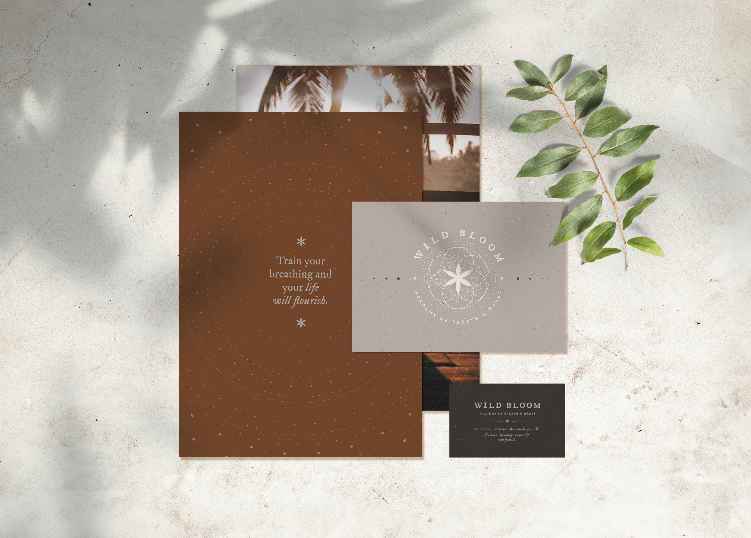
Wild Bloom wanted their logo and brand identity to include an element of sacred geometry and somehow create a visual reference to the nature of their service. They also wanted their brand to feel warm, earthy and feminine.
The Wild Bloom logo uses the initial phases of the ‘flower of life’ geometrical pattern. Thereby including a floral, or herbal element. And the subtle lines within the design represent the rise and fall of the breath and the influence this has upon our mental and physical wellbeing.
What I did:
• Logo design suite
• Brand identity
• Patterns and graphic elements
• Photography style
• Social media posts
• Flyers and leaflets
As well as a warm and earthy colour palette, Wild Bloom wanted to subtly reference ancient knowledge within the brand. So I drew influence from archaic scientific diagrams, illustrations and maps.
Photography of the sky and clouds became an nice way of metaphorically representing breath.


