The Way of Play
Brand & Visual Identity
The Way of Play is a project of two good friends who seek to bring the art of play, truthful expression and youthful joy to school, festivals, retreats, corporate settings and beyond.
Their unique offering and dynamic approach is growing quickly and finding a home within the conscious community and they needed a unique, impactful, playful and earthy brand to communicate their vision, mission and deepest values.
With the tagline - Re-Wild / Re-Child '/ Re-Tribe as my brief, I created an earthy, playful and energetic brand and visual identity that retains a child like spirit, without feeling childish. Their retreats and ethos generally take part in nature and speak to a deeper core of our being - and the brand needed to reflect this. Inspiring the inner child, impressing the inner adult and respecting the inner elder.
What I did:
• Logo design
• Brand identity
• Website design and build
• Social media posts
• Posters and flyers
The logo design came very naturally for this project. I wanted the logo to feel jumbled and with a sense of movement, but contained somehow within a circle (to suggest the completeness).
I added subtle leaves later to reflect the wild nature of their offering.
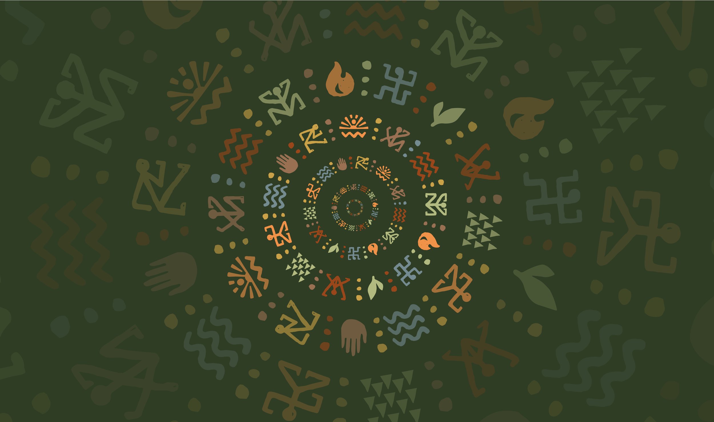
The patterning and colour palette came after, when considering the tagline - Re-Wild / Re-Child / Re-Tribe.
The colour palette, font choice and patterns really come to life on screen - making social media posts and story telling easy, bold and eye catching.
The Way of Play merchandise designs offered the perfect opportunity to literally ‘have a play’ and have fun!
With a variety of graphic elements to aid the design, I used both existing graphics and bespoke illustrations to create a wide variety of options across their wide colour palette.


